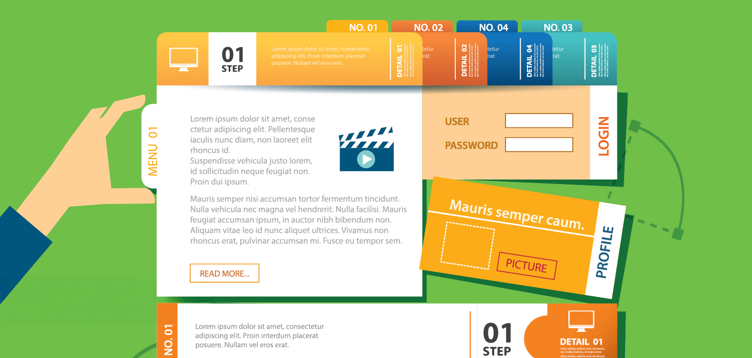
Registration websites are the gateway to your show. They are the first impression an attendee has and can often dictate the opinions and experiences that they will have going forward. It is important for show organizer’s to carefully plan and focus in on making the user experience simple, interactive and as enjoyable as possible.
CompuSystems’ Senior Director of Programming, Frank Anselmo, outlines some tips and tricks for customizing registration websites to maximize your attendee’s satisfaction when registering online.
1. Keep the user in mind.
When you are in the stages of planning and developing your registration website be sure to think about the end user. Your audience is critical in making customization decisions.
2. Go mobile.
Since the vast majority of attendees own a smartphone, be sure to consider making your registration website mobile friendly.
3. Less is more.
Remember that your registration websites are not blog posts or company websites. Keep the material available brief and informative as attendees are not likely to thoroughly read the full site. This means keeping requirements for attendees simple and user friendly. Avoiding excessive button clicks and minimizing required fields can also be helpful.
4. Easy on the eyes.
Registration websites should be aesthetically pleasing. Cut down on overwhelming clutter; white space can be a great way to break up a website into sections. Colors can also be an issue with websites because they subconsciously evoke emotions. Brighter colors will tend to evoke a more intense sense of emotion, so use them sparingly.
5. Read it like a book.
Remember that users read websites as though they are books. By placing important or vital objects and information higher and to the left of the page, they are more likely to be noticed and prioritized by attendees.
6. Aim to please a wide demographic.
Keep in mind that international users or people with disabilities may be using the registration website. To give these users a better experience, try to use larger type face when possible and increase the size of buttons to make them easier to click (also helpful for mobile users). An average of 8% of the male population is considered color blind. Red on a gray background can look like gray on gray to certain users. Finally, be sure to clarify dates and times to keep them from becoming ambiguous. Depending on where the user is from, 5/6/16 can mean May 6, 2016 or June 5, 2016, so writing out the month and day is always safest.
7. Scale down images.
Unless you are developing a photo gallery it is best to keep images smaller. Large images can distract users from the overall message of the page. Also, large images means a large file size, which can impact web performance. User satisfaction can be impacted by their personal internet connection and the particular mobile device or computer they are using.
Putting the extra effort into developing a user friendly site can be well worth it. Customizing sites and keeping your audience in mind will alleviate difficulties for attendees. A simple and successful registration experience allows for an enjoyable first impression of your show.